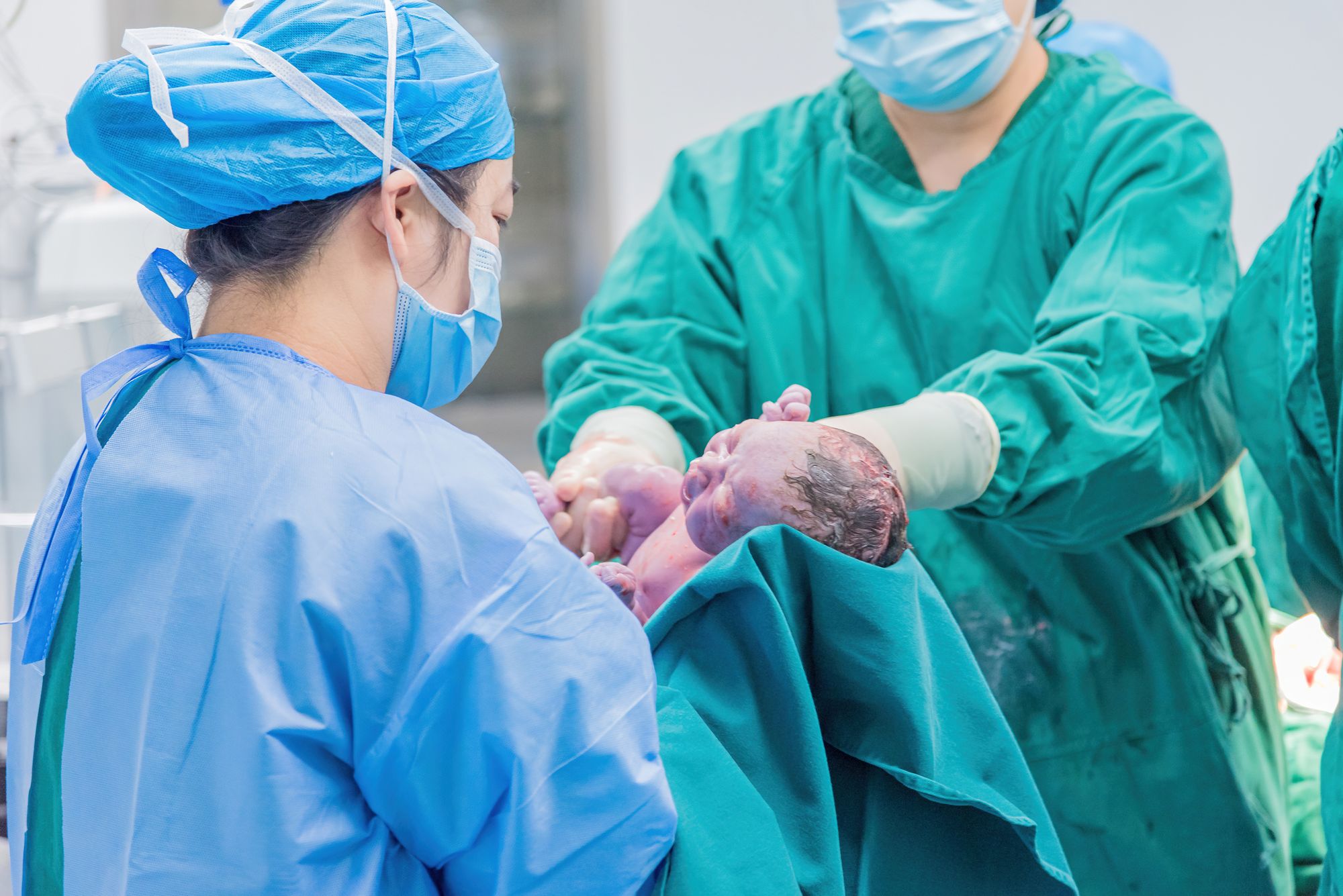
Overview
The thing I had to beat was not another EHR. It was paper.
Quilted Health builds a midwifery-focused EHR, replacing a legacy platform called Maternity Neighborhood. Our own clinical lead had been trained on that legacy system and used it for everything except labor and delivery. For L&D she used a paper flow sheet.
A clipboard never crashes, never logs you out, and never asks you to scroll. That was the bar, and I found it useful to keep saying it out loud.
I designed the L&D flow sheet from research through shipped product: stages of labor, automatic milestone capture, emergency panels for shoulder dystocia and hemorrhage and neonatal resuscitation, side-by-side charting for the birthing person and the newborn, and transport documentation. It is live in production and practices are using it for real births.
The Challenge
Design documentation for the highest-stakes hours in midwifery care, a process that loops, stalls, branches into emergencies, and turns one patient into two, without slowing down the person delivering the baby.
Labor and delivery can last hours or days. It involves continuous monitoring and can escalate in seconds. Every timestamp, every vital, every intervention matters twice: once for clinical safety, and again for a medico-legal record that has to hold up years later.
And a birth is staffed, not solo. Standard practice puts at least two trained attendants in the room. The midwife's hands are in the delivery; a birth assistant or second midwife is usually the one recording. Documentation is a two-person job before it is ever a software problem.
One note on the prior system, because it matters. Maternity Neighborhood was one of the few affordable, midwifery-specific EHRs on the market and kept practices supported for over a decade. It was built for global billing and a single patient context, the constraints that made L&D hard to serve. That is a statement about scope, not quality.
Research
The biggest hurdle when I joined was that I am not a midwife, and I had a limited understanding of pregnancy as a whole.
Planning, prenatal visits, labor, delivery, postpartum. All of it. You cannot design the screen someone uses while delivering a baby if you do not understand what is happening in the room. So before I drew anything, I did three things.
That groundwork is why the feedback sessions could start at "here is a prototype" instead of "explain your job to me." Seven sessions over ten weeks with about eighteen participants, run against progressively more complete prototypes: birth centers, home birth practices, a rural practice with intermittent internet and power, a mobile clinic, a former Cerner and Meditech user, a perinatal data registry, and a midwifery billing and compliance expert.
The cadence mattered as much as the content. I revised between sessions, so later participants were reacting to changes earlier participants had asked for.
What we heard
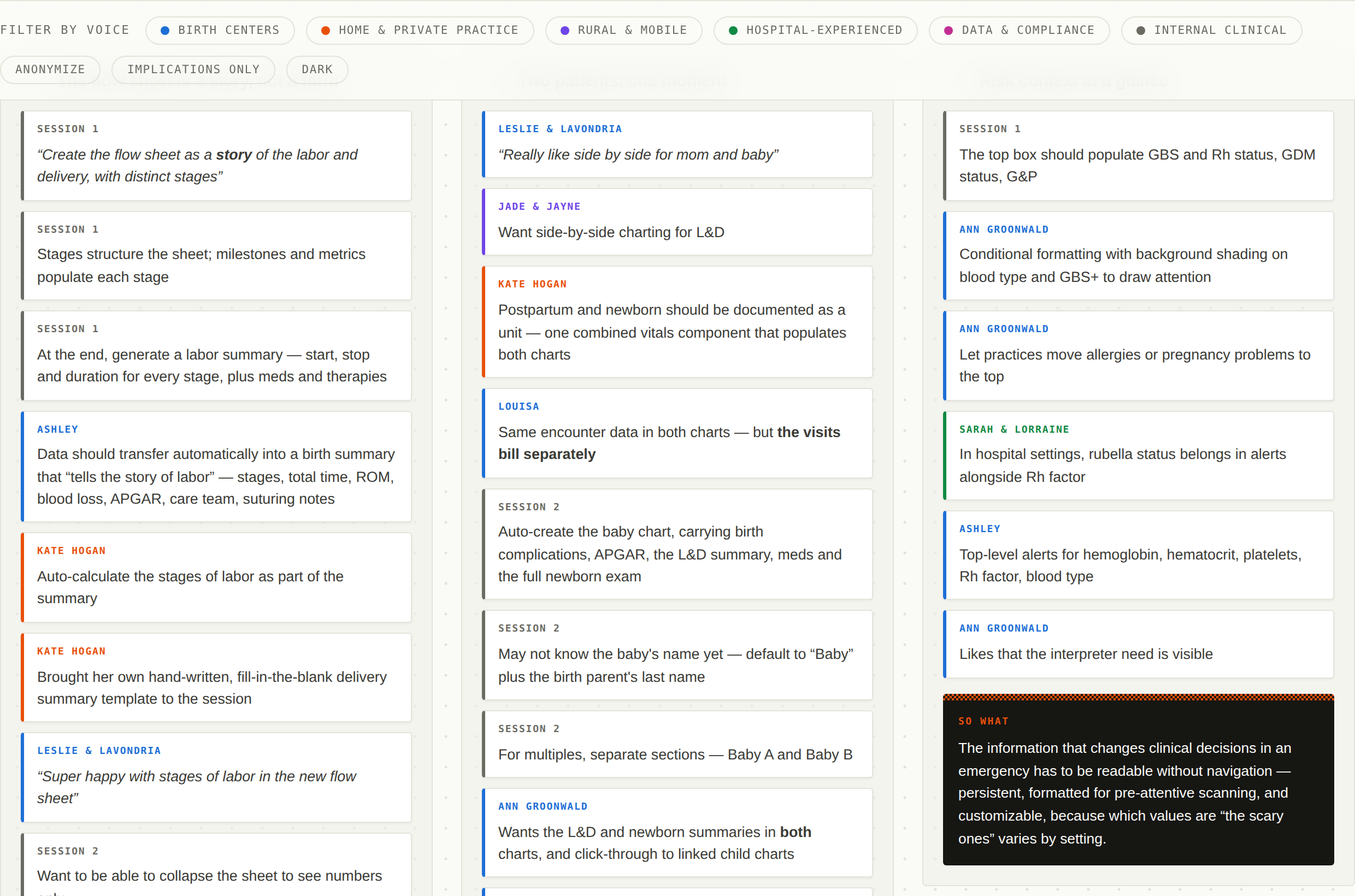
Roughly 180 observations, clustered into thirteen patterns. Every note is attributed, and every cluster ends with the design implication I carried forward.
The shape of a birth
The hardest thing to hold in my head early on was that labor does not proceed in a line.
It loops. It stalls and restarts. It gets reinterpreted after the fact. And at almost any point it can branch into a complication, a transfer to a higher level of care, or a second patient who did not exist a minute ago. So I mapped it: every stage, every branch, everything that has to be documented at each one, and every exit.
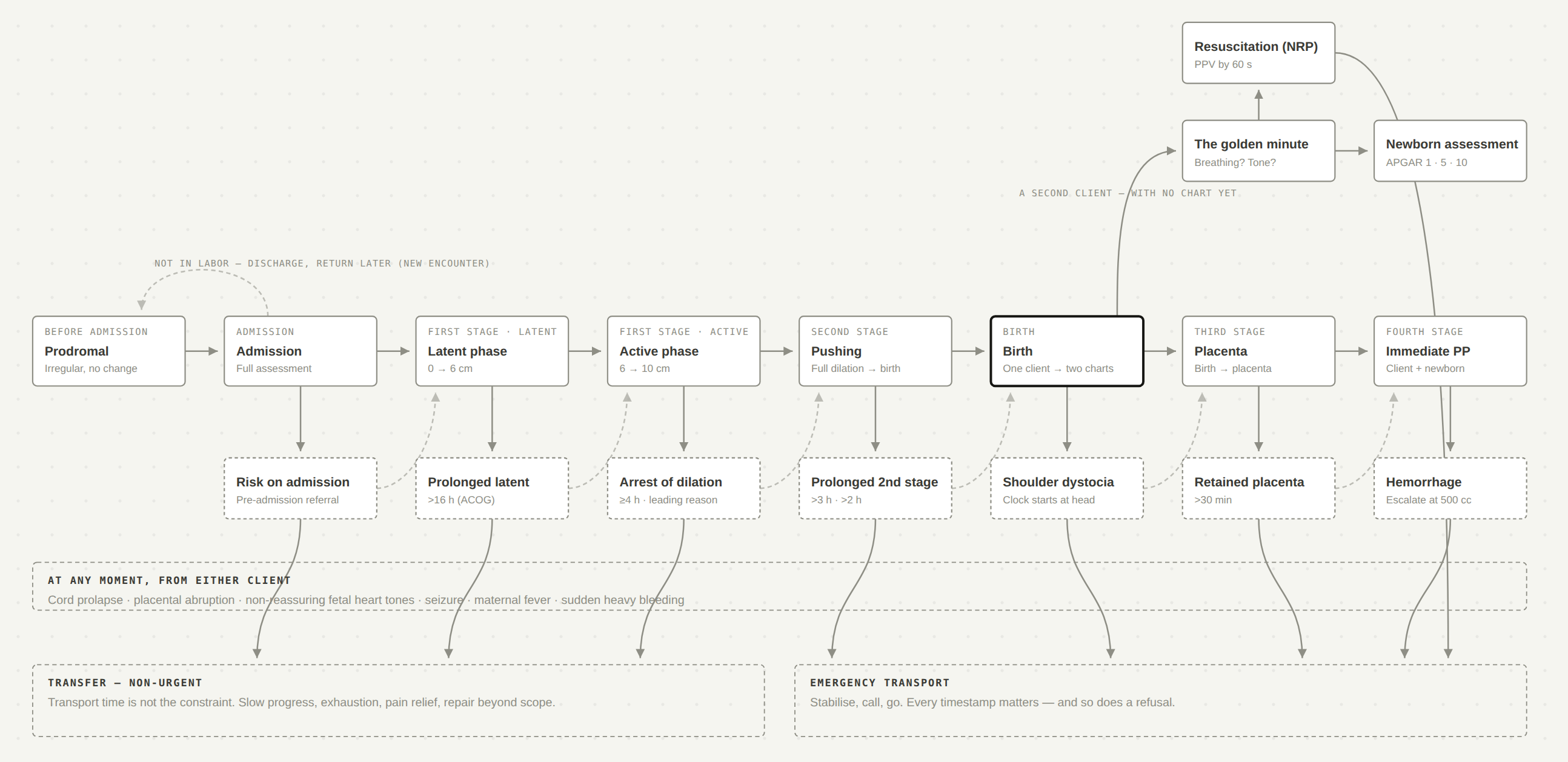
Two numbers from that work reframed the design for me. First-time parents transfer to hospital at rates between 23% and 45% depending on the cohort, against 5.8% to 12% for those who have given birth before. And only 0% to 5.4% of those transfers are emergent.
Leaving is not an edge case. It is a mainline flow, and the overwhelming majority of transfers are unhurried, which is exactly when a system should be capturing a clean record and usually isn't.
Explorations
What I tried first, and what I got wrong.
The value of running seven sessions instead of one shows up in how specific features matured. Two arcs are worth tracing.
Blood loss became a monitoring system. Session 1 asked for one field. Session 3 asked for incremental entry with automatic totalling and a source: placenta or perineum. Session 4 added the choice between estimated and quantified blood loss, a hot key, a persistent running total, and escalation to hemorrhage management at 500 cc with an initiate-or-cancel prompt. The escalation is a suggestion, not an automation: the system knows the threshold, the clinician makes the call.
The head timer became an emergency protocol. Session 2 asked a clinical question: how long between delivery of the head and the body? That produced a clock. By Session 5 the same clock had become the trigger for the shoulder dystocia panel at ninety seconds. A measurement request turned into a safety system, and I only found that because I kept showing the same clock to new people.
Trade-offs
Each of these was a real fork with a cost on both sides.
Gendered vs. gender-neutral language
One practice appreciated "birth parent." Another rejected it as inaccurate for surrogacy and preferred "laboring person." A third wanted "client" everywhere. A rural practice serving a Native community told us neutral language was actively unwelcome. Four practices, four irreconcilable answers, all of them right for their own clients.
Resolved as practice-level configuration, applied consistently through exports rather than only on screen. That last part came out of the research too. The design's job was not to pick a side. It was to make the choice a setting, and then make the setting hold everywhere.
Automatic timestamps vs. an explicit "now"
The same participant said "love not having to click the now" and, a page later in the same session, "for transport, now button next to each event."
Resolved by context. When the action is on screen, the timestamp should be a side effect and the button is friction. When the event happens away from the screen (you called EMS, EMS arrived), the tap is the observation. Same participant, both requests honored, no compromise.
Emergency as a separate tab vs. inside the flow sheet
A dedicated tab keeps the emergency legible and complete. It also risks stranding the clinician away from labor documentation at the exact moment both matter.
Resolved toward escalated views. The emergency changes the layout of the sheet you are already on, keeping both patients visible with no toggle, rather than sending you to a destination. You can always get back, because you never left.
Structured data vs. clinical nuance
Every request for faster one-tap entry arrived beside a request for a note field. A newborn exam is charted normal or abnormal, and Session 7 was clear that binary controls are not enough; every finding still carries a written descriptor.
Structured value first, optional free text attached. Never a free-text box standing in for a data field, and never a data field with nowhere to put the qualifier.
Concurrent charting vs. chart integrity
This one I did not solve at prototype stage, and it is worth being precise about why.
One practice wanted two people charting one birth from two devices, and named its absence as the reason their current EHR is slow. Another practice's system could not allow two users in a chart at all, and they asked for permission refinement instead. That reads like two customers wanting opposite things. It isn't. The first was describing the standard staffing model, the second a limitation of their tooling. Same requirement, opposite symptoms.
The requirement was never ambiguous. The architecture wasn't ready.
What shipped first was attribution (who observed a finding versus who recorded it) because that is the part that carries the clinical and legal weight, and it does not require solving simultaneous edits. True multi-device concurrent editing is still open. I would rather say that than imply the prototype solved it.
The Design
Organised by the decision each group of features serves, not as a feature list.
Entries belong to a stage
Because labor loops and stalls and gets reinterpreted, entries belong to a stage rather than a position in a list, and can be moved between stages when the clinical picture changes. That one structural decision is what lets the sheet double as a narrative afterward. It comes with a collapsed, numbers-only reading mode, because scanning twenty hours of history is a different job from charting the next entry.
Emergencies as modes
Each emergency arrives with its own clock and its own named protocol, triggered by elapsed time or by hand rather than buried further down a form, and it never traps you. The shoulder dystocia panel opens on identification, starts a clock immediately, and presents named maneuvers as one-tap timestamped events. Everything stays editable afterward, because in a real dystocia somebody taps "now" and fills in the detail later. Designing for correction after the fact is not a concession; it is the actual workflow.
Time captured as a side effect
Crowning, head delivery and body delivery are three separate timestamped events, and body delivered is the time of birth. Fetal heart tones record the listening device alongside the reading, because a doppler and a fetoscope are not the same evidence. Blood loss accumulates automatically, no manual math at 2:30 AM.
Two clients from one second onward
Birthing person and newborn side by side, no scrolling and no navigating away. The newborn chart is created by the system from the newborn physical exam and linked to the parent chart, because the alternative is a human doing data entry while holding a newborn. APGAR at three fixed intervals, separate sections for multiples, and a different colour on the newborn tab, which was the cheapest possible way to prevent charting on the wrong patient.
A quiet second set of eyes
Provider-configurable reminders: check fetal heart tones every X minutes, prompt a full assessment every four hours, plus elapsed-time indicators showing how long since the last listen. In a labor that runs twenty hours, the risk is not that a clinician has forgotten the protocol. It is that time blurs.
Transport, documented start to finish
One-tap timestamps for call placed, EMS arrival and departure, pre-populated reasons, selectable chart data to send with the transport record, and a place to record consent or refusal. The refusal case is the highest-liability version of this event and the one most likely to be documented badly.
Who can write, and who can sign
A birth is staffed, so the permission model had to separate authorship from attestation. The role that ships as Scribe has full write access across every tab of the encounter, and cannot sign, lock, or amend it. Signing and locking stay with the provider. The birth assistant can chart the entire labor while the midwife's hands are busy, and the midwife still attests to the record.
That maps almost exactly onto scope of practice: state guidelines let a birth assistant record findings in the health record while the midwife retains all assessment and clinical decision-making authority. The permission model is shaped by a legal boundary rather than by seniority, which I think is the right reason to draw a line like that.
The L&D encounter also has its own pre-charting step to record who is in the room: provider, birth assistant, and doula support. It is the only encounter type in the product that has one, because it is the only one where the room is crowded.
Impact
Shipped and in use. The L&D flow sheet is live in production and practices are using it for real deliveries, including the emergency panels, the milestone capture and the side-by-side newborn view included.
Validated by the people who do the work. A practice evaluating us against three other EHRs said they were "super happy with stages of labor in the new flow sheet" and found it much easier to find where data belongs. The shoulder dystocia panel and the mom-and-newborn view drew the strongest reactions in walkthroughs.
What I can't claim yet. I do not have before-and-after metrics on charting time or documentation completeness. The system is in production but not yet instrumented for that comparison, and I would rather name that boundary than fill it with something softer.
"Congratulations on, for not being in the pregnancy realm, understanding and being able to extrapolate into relevant options. It's really good."Midwifery billing and compliance expert, after a full walkthrough
Worth reading against the opening of this case study. I started knowing nothing about this.
Reflection
Three things I would do next, in the order I would do them.
The thing I keep coming back to is that the hardest constraint was never technical. It was that the incumbent, a clipboard, was genuinely excellent at the two things that matter most at 2:30 AM: it is always available, and it never asks you anything. Every decision in this project was some version of earning back the ground that gives up.