Overview
Ares fills a gap no mainstream pet health app addresses: the clinical precision epilepsy demands, in an interface designed for a panicking owner at 3 a.m.
It records seizure episodes with veterinary-grade classification, tracks medication adherence with drug-class-aware reminders, surfaces patterns over time, and turns months of logging into a vet-ready report. I owned it end to end, problem definition, information architecture, interaction and visual design, the data model, monetization strategy, App Store submission, and then built it myself in SwiftUI. Working solo meant every design decision was also a technical and product decision, which kept the constraints honest and the scope tight.
Why I Built This
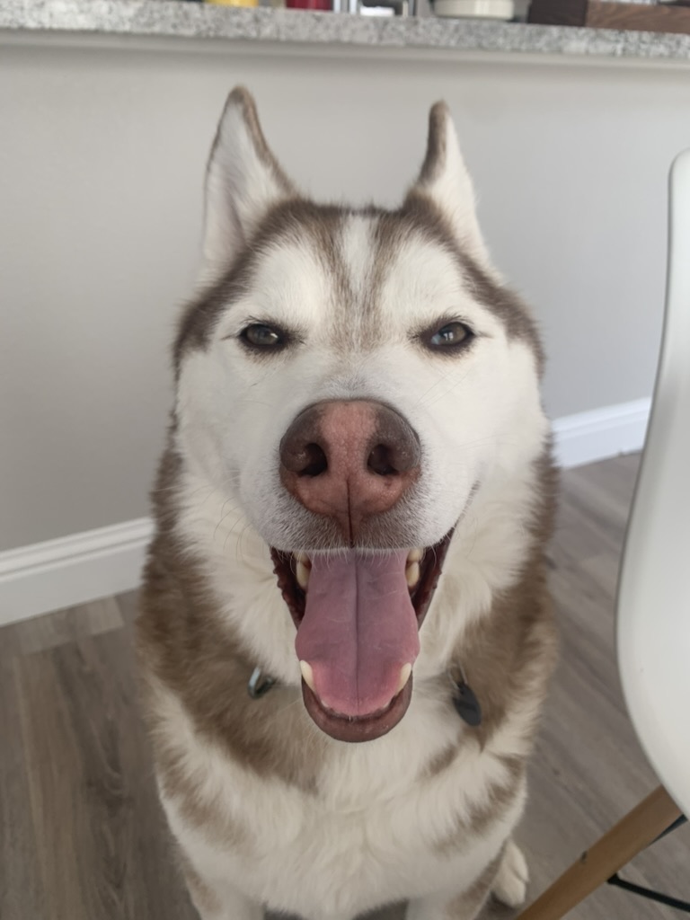
Ares is named after my Siberian Husky. We lost him to epilepsy on April 13, 2023, at the age of seven.


While he was alive, I tracked his seizures the only way I knew how, a plain Notion table called "Seizure Log." Each row was an episode: a name, a date, a rough time of day, a free-text note ("Lasted about 1-2 minutes. He was paddling. Not as disoriented as before."). It worked, barely. It never gave me the picture I needed: how often, how long, whether they were getting worse, whether anything I did made a difference. The data was trapped in prose, unstructured, unsearchable, impossible to chart.
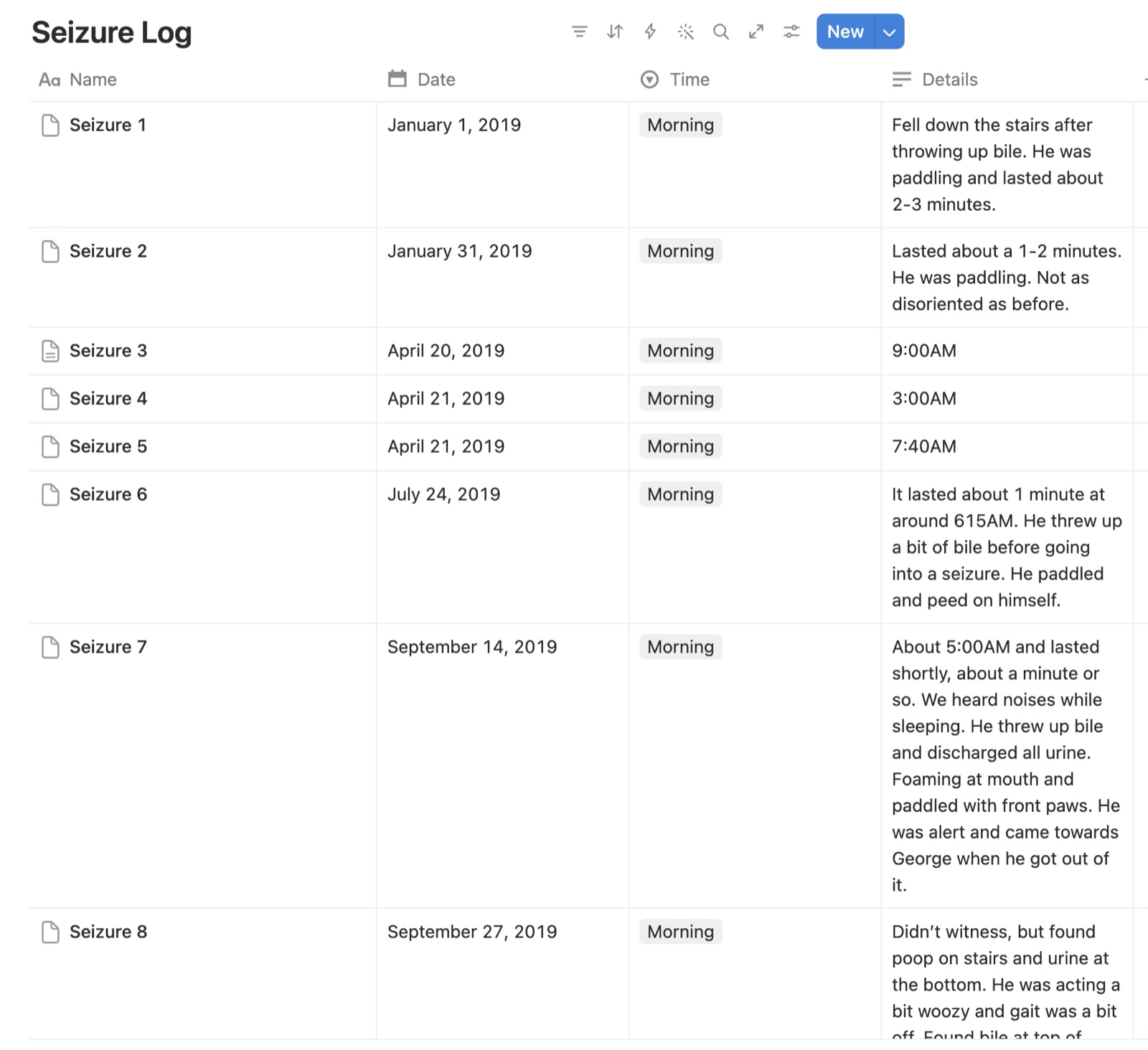
Every row is tagged "Morning," while the time I actually needed sits in Details as free text: "9:00AM," "around 615AM," "About 5:00AM." Three entries are a bare timestamp, the rest run a full paragraph, and one begins "Didn't witness." Two fell on the same April morning, hours apart, which is exactly the pattern a vet asks about and exactly the thing this table cannot show you. None of it sorts, filters, or charts, which is the only reason to keep a log.
After he passed, I wanted to honor him by building the tool I wished I'd had. My brothers helped me start, Eric on early explorations and flows, Gilbert on the iOS build, before life intervened and the project sat for two years. In February 2026 I picked it back up: partly to finally do right by Ares, partly to see how far I could push myself to design and build a fully functional iOS app from scratch. That meant learning on the way, Xcode, developing with Claude Code, auth in Supabase, subscriptions with RevenueCat, sync with CloudKit, and wearing the product manager hat for scope, pricing, and notification strategy.
Five months later, Ares shipped to the App Store. This case study is the design story. Underneath it, Ares is a tribute.
Research
When a dog has a seizure, their owner's world narrows to a single terrifying moment. The episode ends; the questions don't. How long did it last? Was it worse than last time? What do I tell the vet?
I'd lived this firsthand, and I wasn't alone: dog parents managing canine epilepsy track seizures in Notes apps, spreadsheets, and paper journals, or not at all. Existing pet health apps are generalist tools built for vaccination reminders and weight logs; none handle seizure classification, post-ictal symptoms, trigger correlation, or adherence monitoring. The one purpose-built competitor, the RVC Pet Epilepsy Tracker, hadn't been updated since 2019 and suffered data loss, broken logins, and no offline support. The gap was clear: clinical rigor plus crisis-ready UX.
I didn't design from assumptions, I designed from years inside this community, triangulating across lived experience with Ares, the canine-epilepsy Facebook groups I'd been part of for years, Reddit threads on how owners describe and cope with seizures, conversations with fellow epi-dog owners, and clinical research on seizure types, post-ictal symptoms, and AED versus rescue-medication behavior.
One theme cut across all of it: owners struggle to describe a seizure in words, and vets struggle to act on a verbal recap. "It looked bad", but a 30-second video communicates more than a paragraph ever could. That insight became one of the app's defining features.

The Problem
Three user states, each demanding a fundamentally different interaction pattern, this model became the spine of every decision that followed, including the navigation.
The timer needed to feel like an emergency tool. The medication flow needed to feel like a habit. The insights needed to feel like a conversation with data.
Design Decisions
5.1Crisis-first timer UX
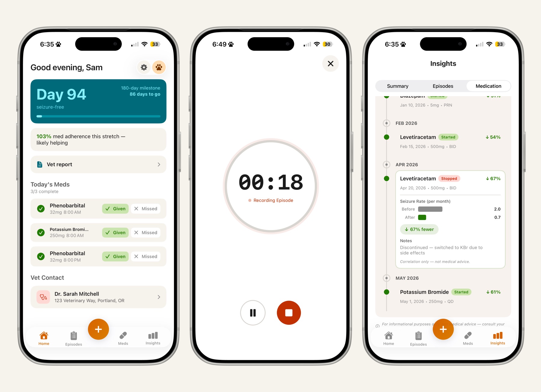
The seizure timer is a full-screen takeover: a large monospaced time display readable at arm's length, a pulsing glow ring for active feedback, the app is with you, and three controls. Pause, Resume, Stop. No settings, no menus. A red recording indicator borrows a mental model people already have.
The timer is also a triage tool. A seizure lasting more than five minutes is status epilepticus, a life-threatening emergency. At the 5-minute mark the timer surfaces a warning: get to a vet now. The app doesn't just record the crisis; it knows when the crisis has escalated, at the exact moment the owner is least able to remember clinical thresholds.
The tension: after stopping the timer, the user must log clinical details, but they're emotionally drained. The two-step post-timer flow pre-fills an episode form with the recorded duration and offers "Add More Details" or "Not Right Now" on a non-dismissable sheet, so data is never lost by accident. The form itself collapses to essential fields, and a follow-up notification fires 30 minutes later if the episode is still incomplete.

5.2Adaptive notification escalation
Not all medications carry equal urgency, so a one-size reminder is wrong. AEDs get strict 3-tier escalation, reminder → 30-minute follow-up → 2-hour escalation with urgent language, because a missed dose can trigger breakthrough seizures. Rescue meds get a single situational reminder. Supplements get a gentle nudge. Doses can be marked Given or Missed from the lock screen, and a 15-minute snooze acknowledges that "I'm driving" is not "I forgot." Adherence rolls up over 7- and 30-day windows, a streak worth protecting.
5.3Information architecture
Five tabs with a center floating action button, each mapped to a user state. The FAB keeps the highest-stakes actions, Start Timer, Log Episode, Log Dose, reachable from anywhere.
Dashboard, metrics, today's med cards with Given/Missed actions, recent episodes
RoutineSeizure log, month-grouped, searchable
ReflectiveStart Timer, Log Episode, Log Dose
CrisisDose history and adherence rings, with medication management
RoutineCharts and pattern analysis
Reflective5.4The data model as a design tool
The Episode model is a first-class design artifact: clinical classification mapped to veterinary terminology, temporal data for trend analysis, contextual signals for pattern correlation, cluster-episode linkage (seizures that arrive in groups are clinically distinct), and a 3-tier severity rating that drives color-coding across the history. Every field was a decision about what's worth the user's cognitive effort to capture, especially under duress. Triggers and post-ictal symptoms are collapsible and hidden by default: clinical completeness without form fatigue.
5.5Photo & video, the vet's favorite signal
The single most validated differentiator from research: a seizure is hard to describe and impossible to reproduce in an exam room, but a short clip lets a vet see paddling, awareness, duration, and recovery directly. Media capture is first-class in the episode record, record or attach from the logging flow, browse a carousel, play video inline. Free users attach up to two photos per episode; Pro raises it to five and unlocks video, the format vets value most, feeding the vet report. Vague verbal recap becomes shareable clinical evidence.

5.6Privacy-first architecture, and how it evolved
At v1.0, all medical data lived on-device: no server-side health data, no analytics. The privacy policy became a feature, your dog's medical data never touches our servers. The trade-off was real and shipped knowingly: no cross-device sync, data at risk on phone loss. I documented backup as the top post-launch priority, and it became the whole of v1.1.
v1.1, sixteen days after launch, added automatic backup and sync via CloudKit's private database, episode data syncs through the user's own iCloud account, end-to-end within Apple's infrastructure. It still never touches a server I operate. The privacy promise survived the sync feature; it just got a better failure mode. A "Restoring your data from iCloud" banner reassures returning users that months of seizure history survived a lost phone; a sync status indicator makes backup state legible; keychain persistence lets returning users skip onboarding entirely.
5.7Monetization
Freemium that gives away the daily utility and charges for the analytical layer. Free: episode logging, medication management, reminders, monthly trend summaries, two photos per episode, a complete product for day-to-day management. Pro ($3.99/mo or $29.99/yr, 14-day trial): the full insights dashboard, vet-report PDF export, five photos, video. The principle: free users should never feel punished. Monthly summaries stay free deliberately, the taste of insight that makes the upgrade feel earned rather than arbitrary.
Shipping Through App Review
Getting approved turned out to be a design problem of its own. Three rejections, and each one reshaped a real user-facing surface.
Taken seriously, compliance constraints mostly push toward more honest UI.
AresTheme
The palette is personal: warm copper and soft white, drawn directly from Ares's coat. He stays present in the product without ever being literal, and the warmth is a deliberate counterweight to a clinically heavy subject.
AresTheme is a semantic token system, so color always carries meaning. Four principles govern it:
Every token ships as a paired light/dark colorset, built dark-first with full light-mode parity, because seizures so often happen late at night and early in the morning. Light surfaces lean warm off-white to match the copper temperature. On iOS 26 the app adopts native Liquid Glass, degrading gracefully to material blur. The system spans 40+ components, adherence rings, dose cards, episode cards, metric cards, insight charts, and the custom tab bar with center FAB. Color-blind-safe palette validation is the documented next step.

Outcome
A first-mover entry into a medical niche with no actively maintained competitor, a specialized, privacy-first health tracker, now live and syncing.
5 mo
Solo, from reviving the project to live on the App Store
16 days
From v1.0 launch to v1.1 iCloud Sync, closing the biggest documented risk
1st pass
v1.1 App Review approval, after v1.0's three rejections became design lessons
What I'd do differently. Design for App Review from the start, primer neutrality, paywall terms, and SIWA requirements are all knowable upfront. Add medication setup to onboarding, since this population is almost always medicated. Build accessibility into the component system from the start. And deepen the free-tier insight teasers so the Pro upgrade feels even more earned.
Post-launch priorities: richer free insight previews, medication setup in onboarding, full accessibility coverage, and real usage data in this case study once there's enough signal.
Every timer interaction is optimized for panic, designing for the user's worst moment turned out to be the clearest brief I've ever had.Design principle, carried through every decision